Rust Marque Logo

Devblog 106

A packed blog this week: we've added flame-throwers (and water buckets) to the game, and we have the first look at the tech tree, the wrecked Powerplant tower, and our new musical instruments. Plus optimisation, sound tweaks, and more.

14 April 2016
Devblog
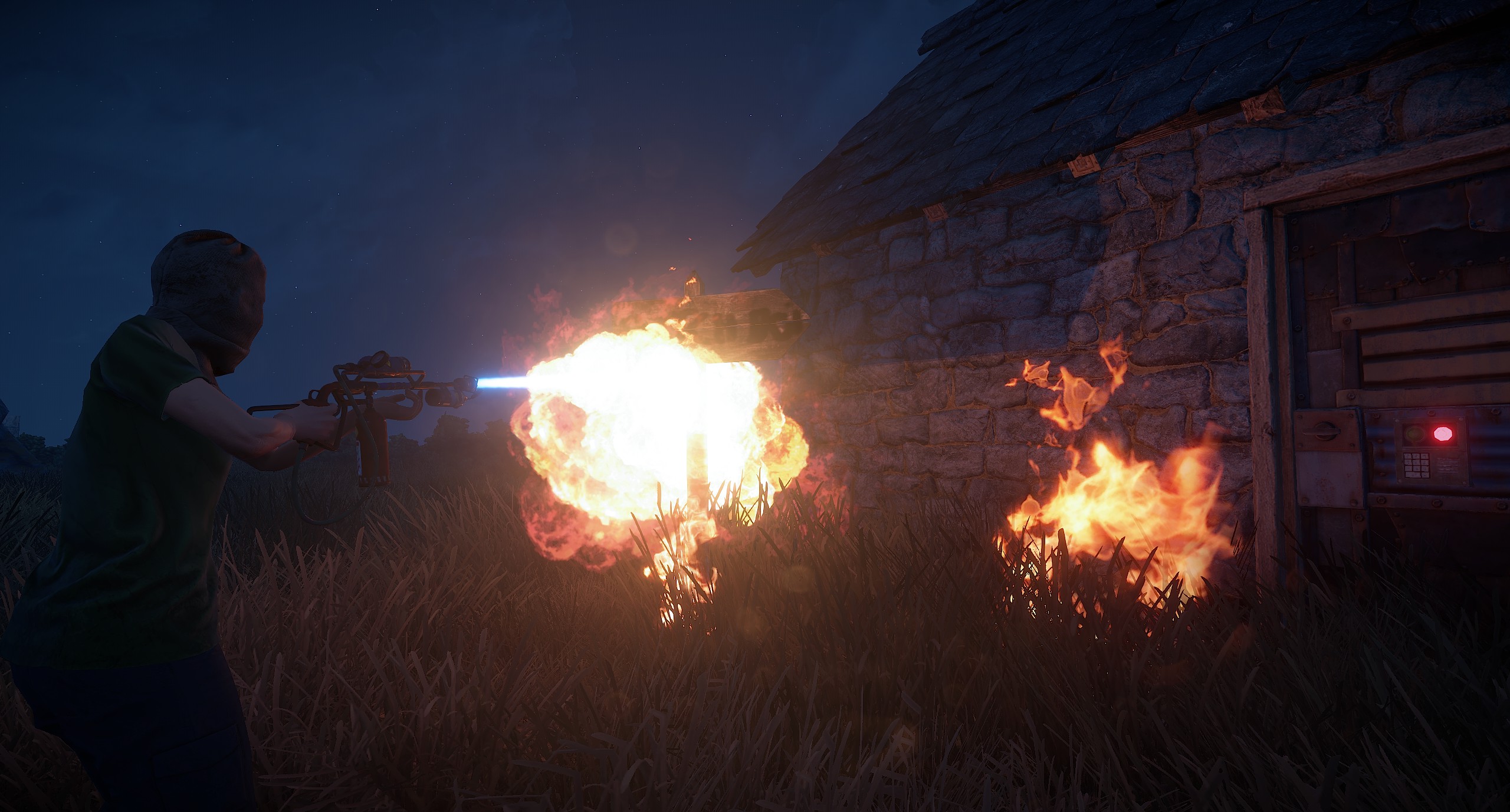
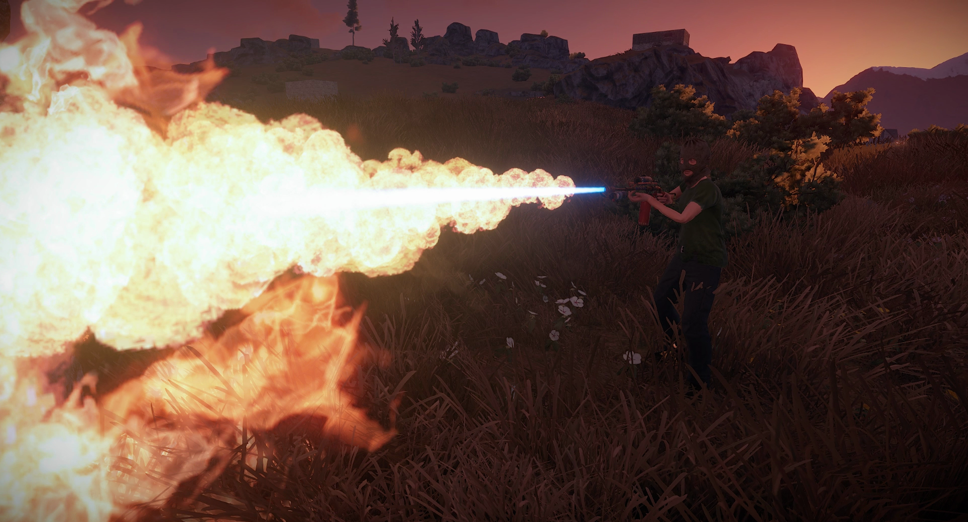
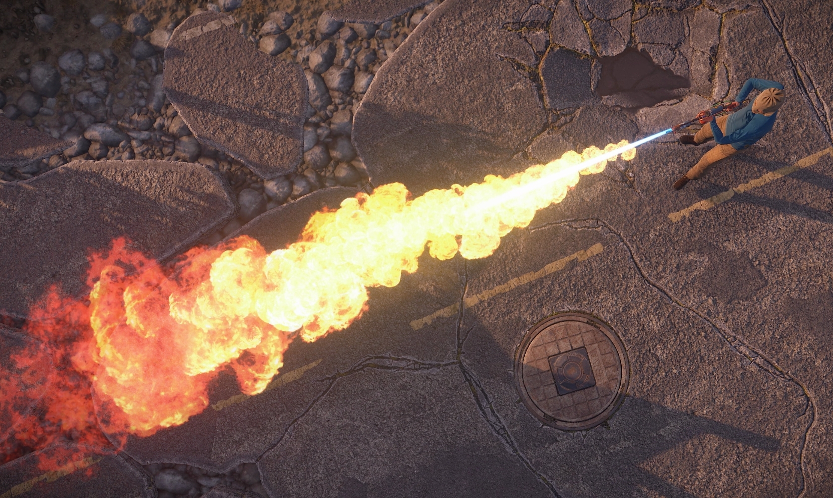
I really wanted to give you guys something extra to play with, so I stayed up until 6am getting this baby done. This was an interesting and difficult task to get right, but I’m quite happy with the end result.
It’s somewhat rare, it eats Low Grade Fuel like candy, but boy is it devastating. It’ll take out wood blocks no problem, it’ll also damage stone (for now) albeit at a very high fuel cost. It’s also great at cooking other players. Next week I’ll probably have to make a bunch of balance changes and fix some bugs as well as add some new functionality (like people actually catching on fire with damage over time), but I felt it was complete enough to push to the main branch just in time for this patch. Please enjoy.
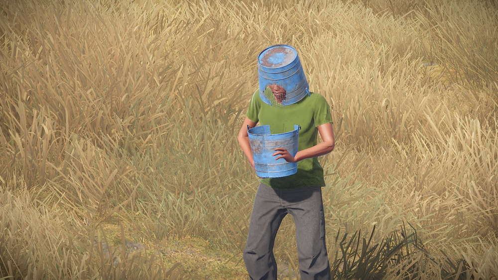
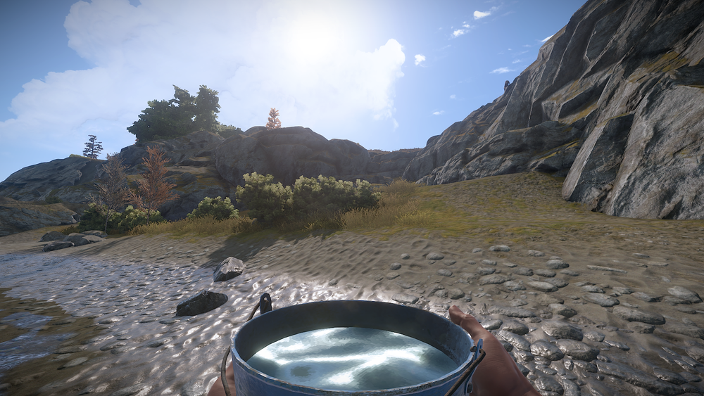
The water bucket is now live as well. It’s found commonly in barrels and is in the BP frag tier. Use it to gather water from the world or to transport water from point A to B. You can also use it to splash an area in front of you with water, which will put out any flames. This should be useful when your base is under siege by Flamethrowers or Incendiary rockets. In the very near future it will play a major role in gardening.
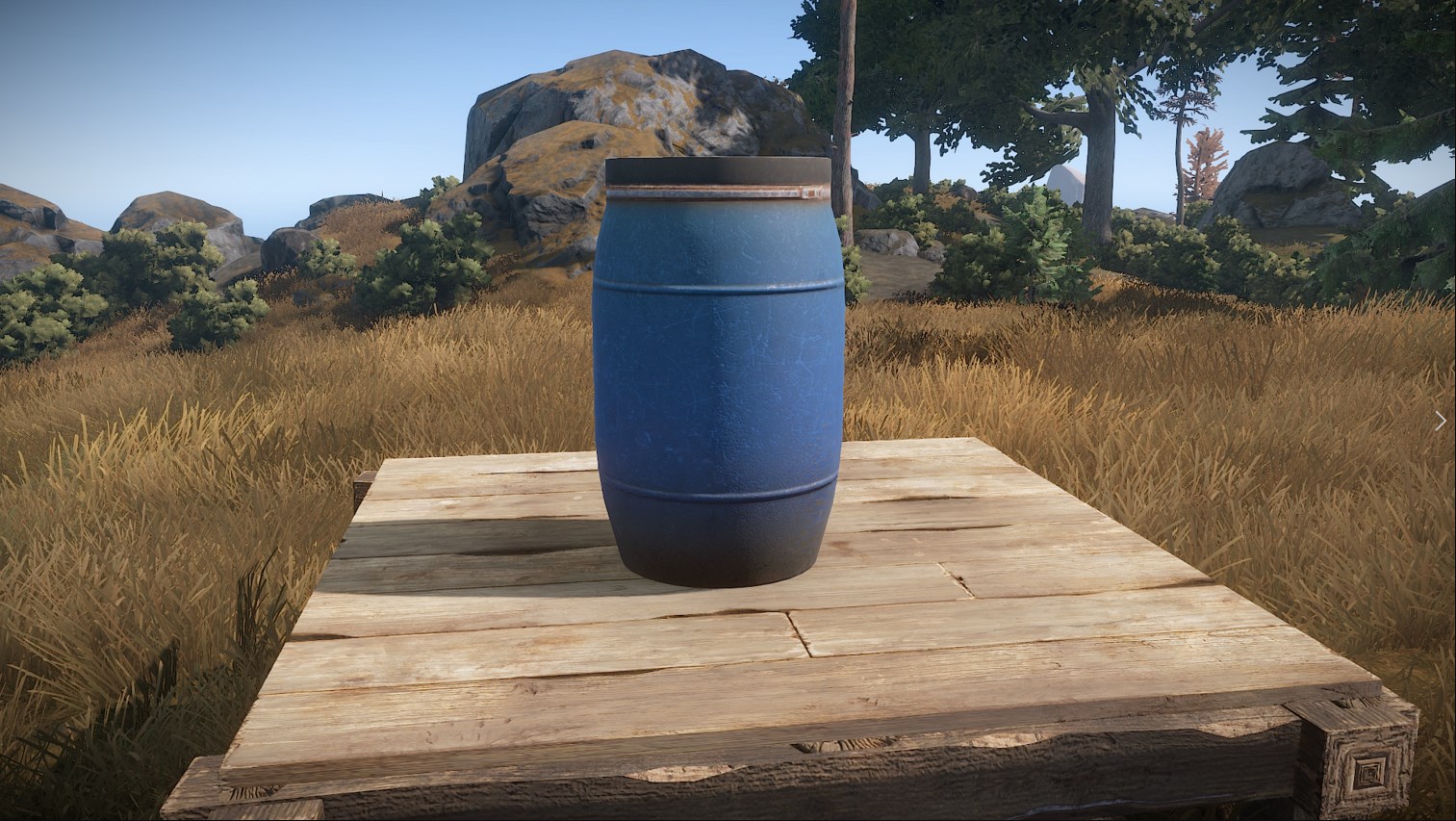
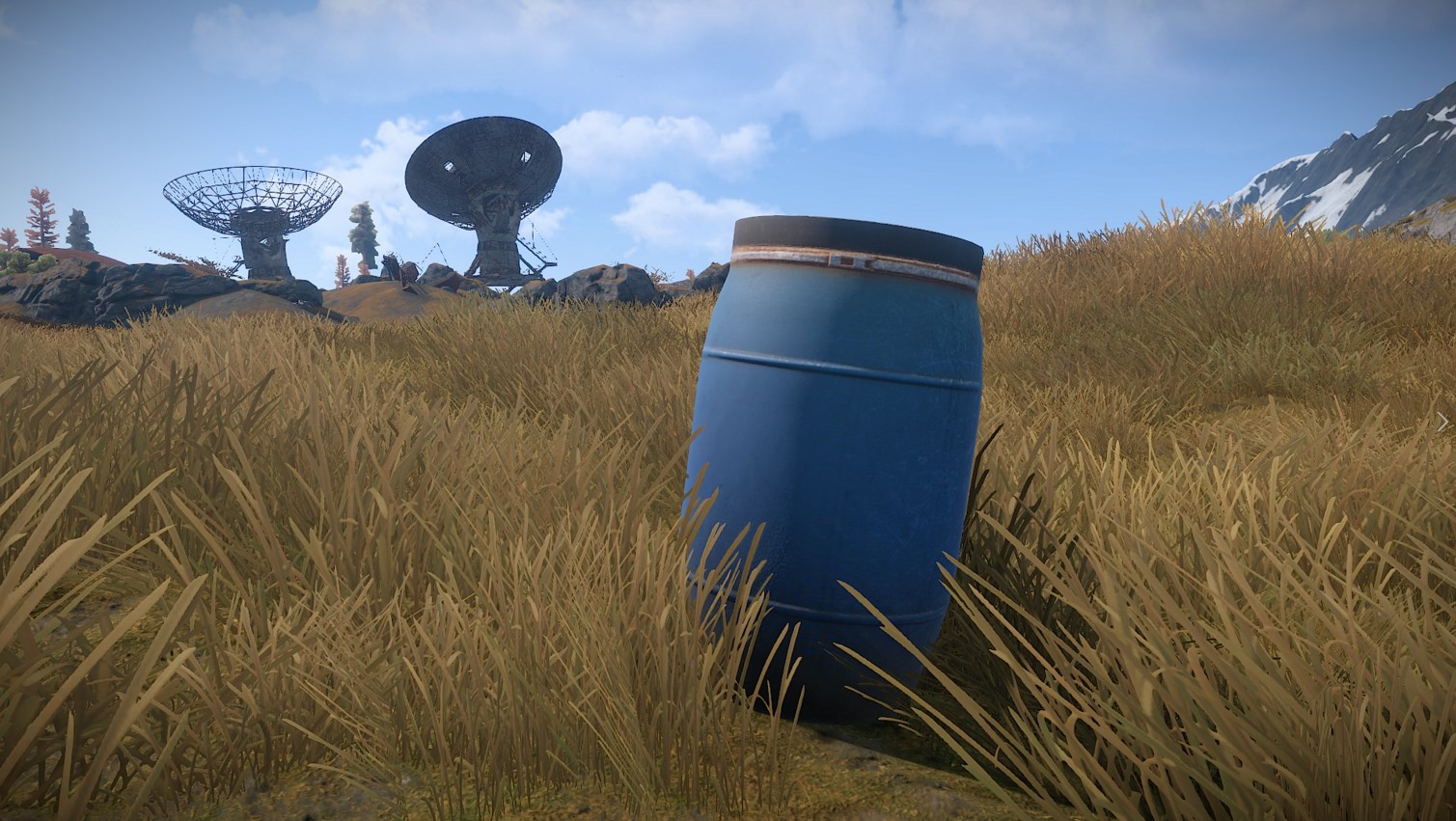
I’ve added a simple deployable to help with storing water. It doesn’t gather any from the world like the water catchers do, but it does give you a place to bank water for use later. It can be placed indoors or outdoors and is pretty cheap resource wise. The art is WIP and will be replaced with something a little better soon. Barrels and buckets via Rustafied.
I cranked away at the XP branch this week: we have a working search now, the skin selection box scrolls, the craft queue scrolls, and the cancel button works. I also did a lot of work in making sure you could only craft stuff when the parent was unlocked, and trying to explain that to the end user. The search shows all items, even those that you haven't unlocked, so hopefully you'll be able to search for an item you're thinking about and be able to find out what level you need to be to get it, and what you need to unlock to get there.
There's still a decent amount of work to do here, but we're edging forwards. The people on the prerelease server seem to be enjoying the new system, and Unity is doing a good job of getting 5.4 relatively stable. So we're getting there.
We did some profiling and found a couple of bugs that could have caused the lower framerates experienced since last week's patch. We aren’t sure exactly how much of an improvement you may see, but the CPU side of things was improved by several milliseconds due to a few regressions from last week's procgen merge. There were some issues with thousands of ambient sounds updating constantly, and part of how the water reflections got access to the main camera was extremely slow. Both of these have been fixed. Fingers crossed you guys see an improvement!
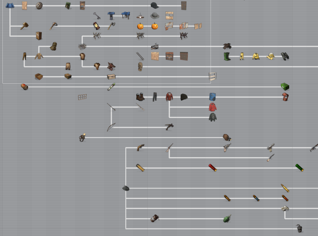
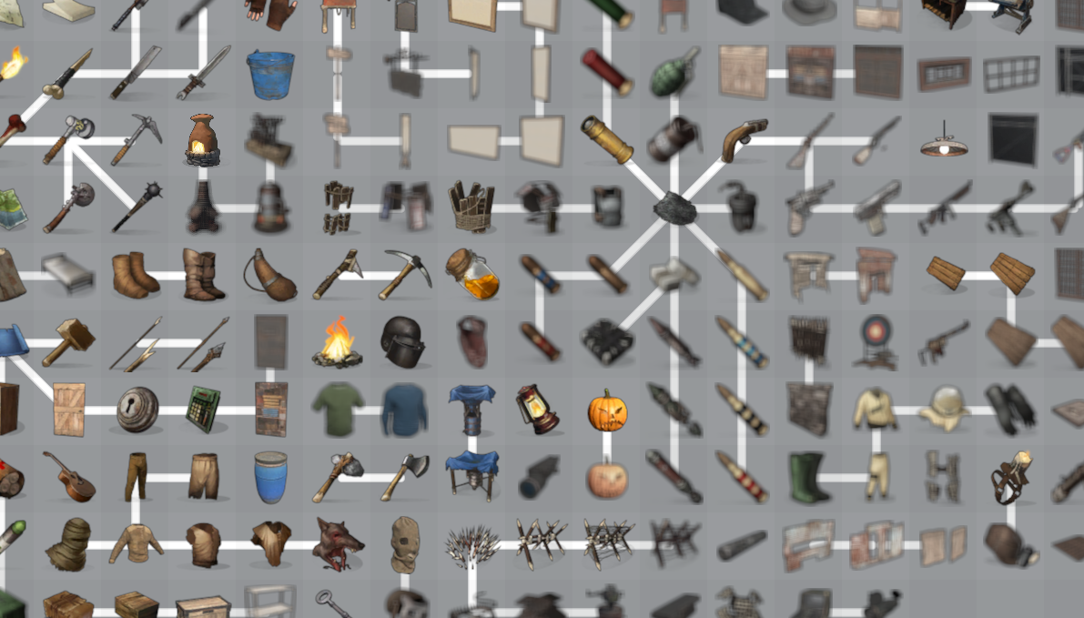
I fucked around with the tech tree visualization this week. One of the things with the new XP system is that blueprints are organised in a heirachy, so you have to unlock one item before you can unlock another. For example, you need to unlock the wooden spear before you can unlock the stone spear. The problem is how to visualize this? How to show the player that they have to unlock these two items before they can unlock the item they want to? Or how to show the player that an item they want to unlock will unlock at level 7, and needs this item unlocked first? I started off with a timeline looking system, where levels were expressed on the X axis. This worked to a certain extent, but it ended up being too spread out. It didn't scale well at all. So I thought, fuck the level on the X axis, bunch them all together and blue the icons out that we can't spawn because they're level locked. This works from a technical point of view, but I can't help but feel it is way to busy visually, which makes it pretty tricky to read. This is only going to get worse when we have to add indicators for stuff being locked etc. So right now I'm leaning towards having the second mode, but only showing the tree that contains a selected item. It's going to take a bit more experimentation to get right.
A while ago I added convars to ramp up the tree and mesh quality much higher than the default settings, but they were hidden from the user and only very few people knew about them. The tree and mesh quality sliders in the options menu now go up to 200, which unlocks some of that additional visual quality. I’ll see how this goes, but we’ll probably end up allowing even higher settings when we replace all those confusing sliders with more descriptive quality settings in the next options menu overhaul.
Finally got around to push the light scattering updates I’ve been working on a couple of months ago. This includes directional light occlusion, which fixes fog being lit through mountains around sunrise and sunset. I also used this opportunity to fix a couple of scattering related issues with our cloud assets.
I fixed a regression that could make it rain without any clouds being visible and adjusted the cloud visibility during extremely foggy weather. I’m also using a new equation to calculate the fog density, which not only makes terrain fogging look a lot nicer but also makes it harder for people on sniper towers to spot people on the ground during foggy weather.
I took some time to investigate the framerate drops people have been experiencing when entities spawn in from the server. I found and fixed a number of issues and things are starting to perform better again, but there’s still some work left to do in that department.
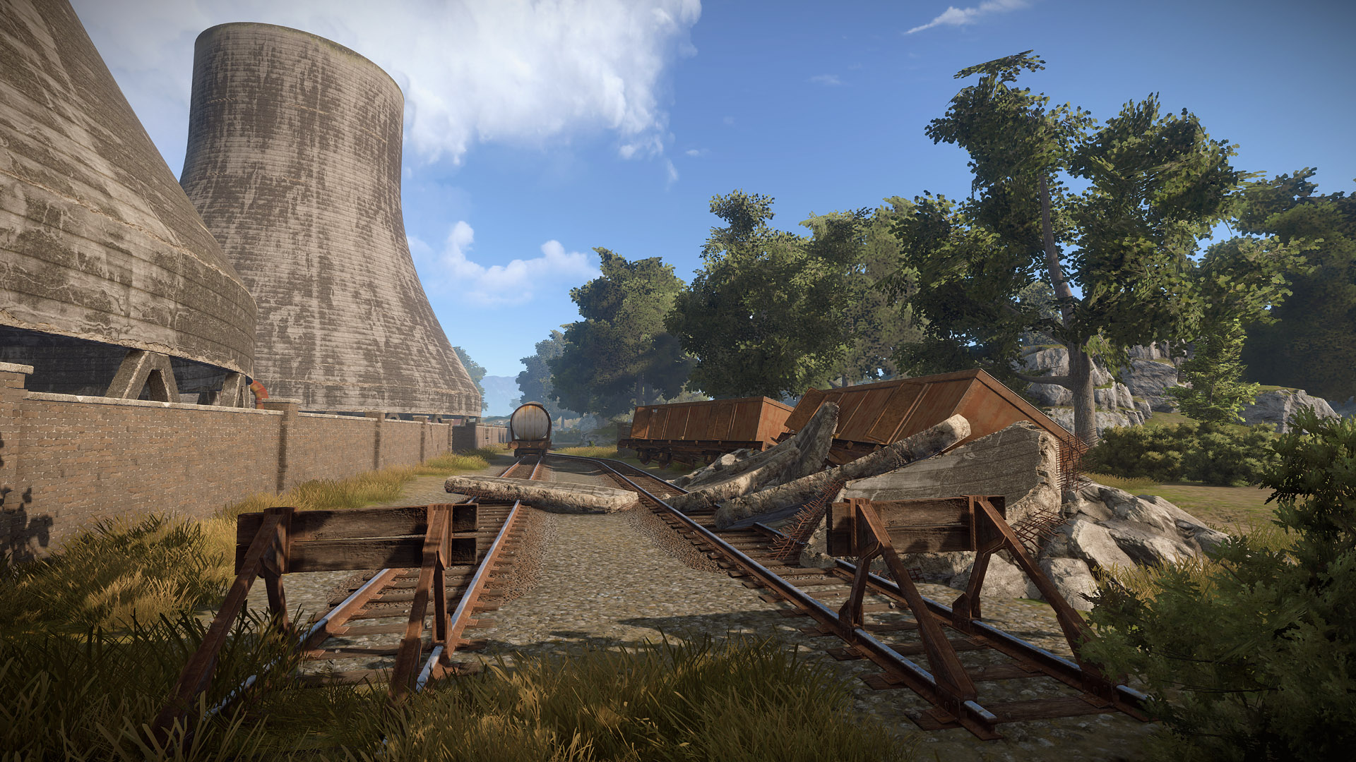
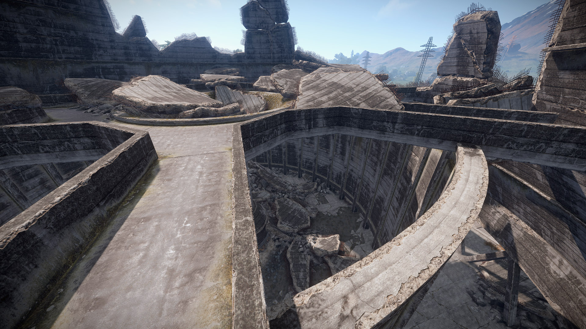
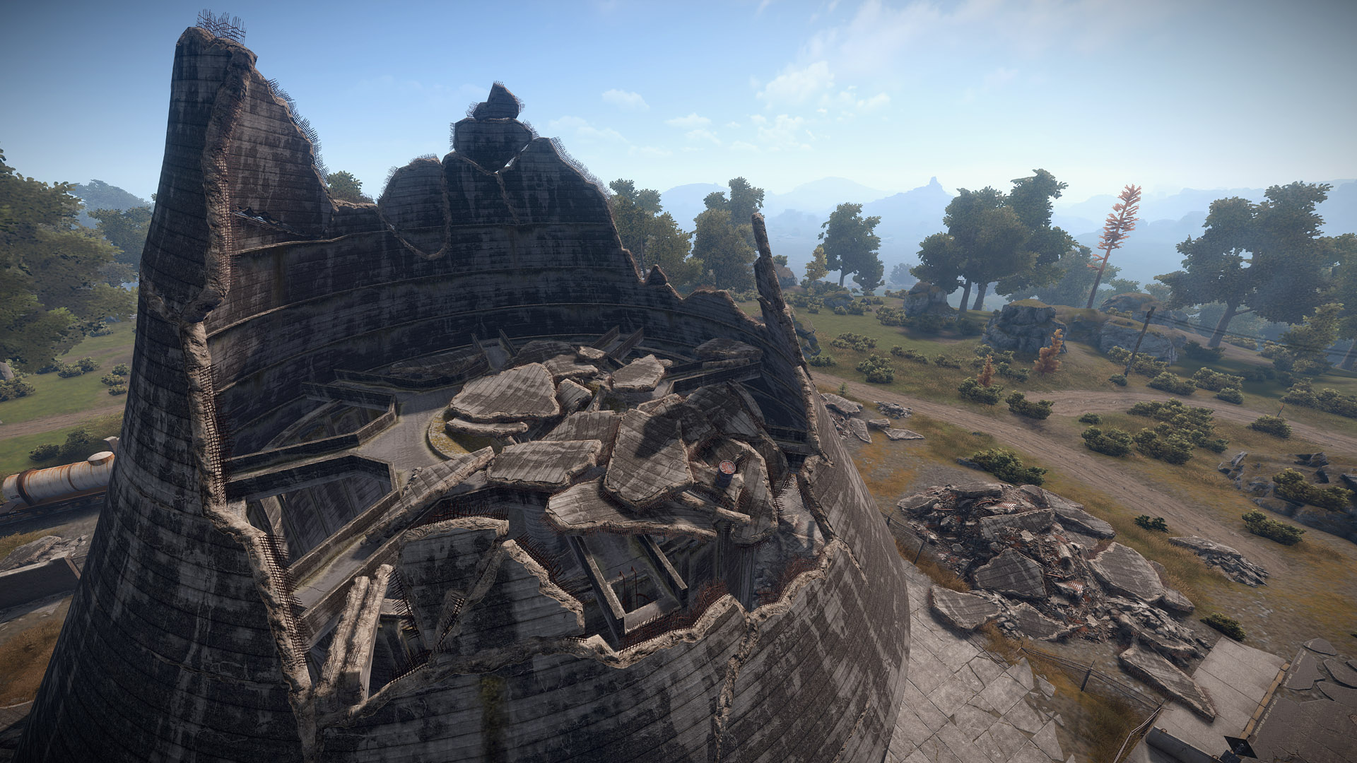
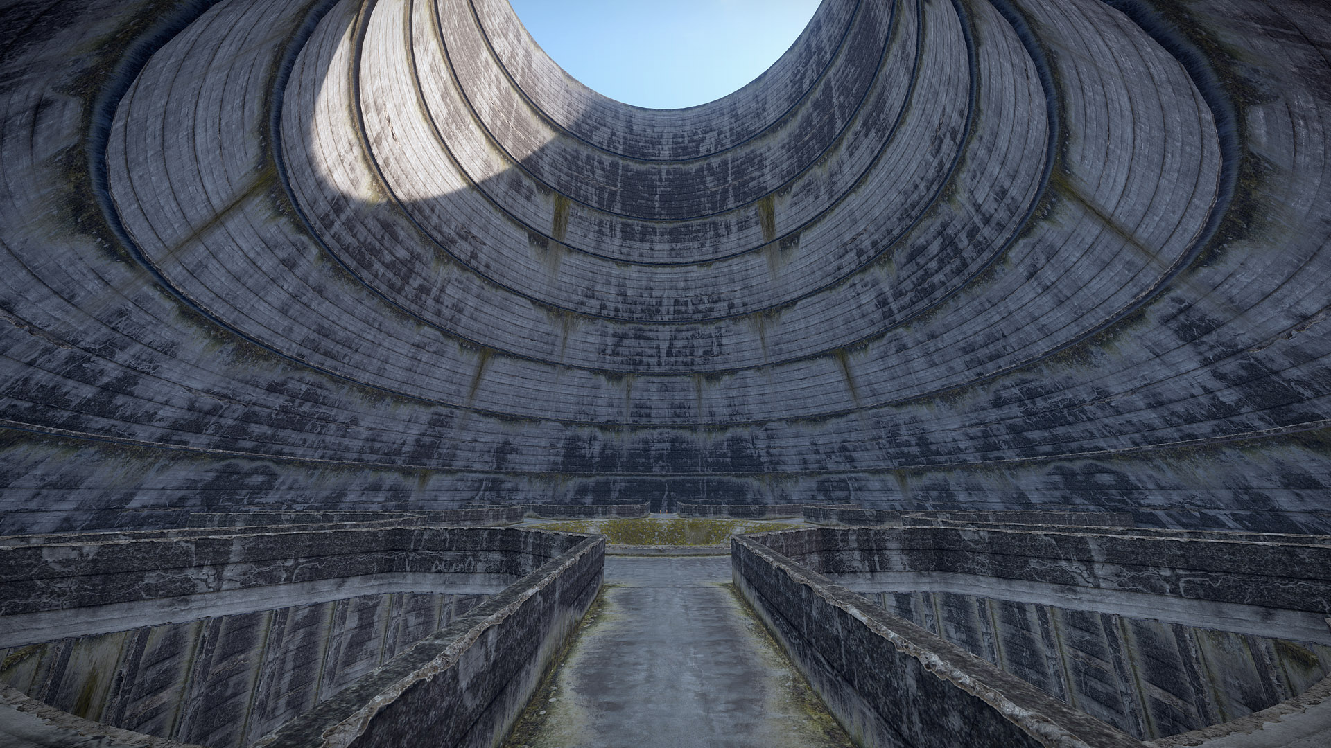
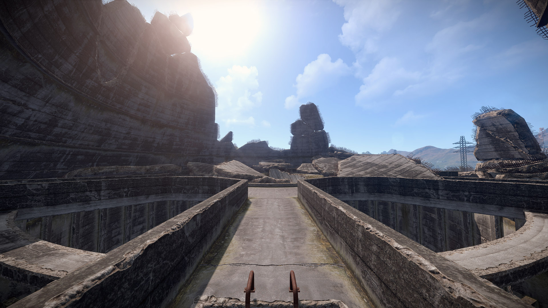
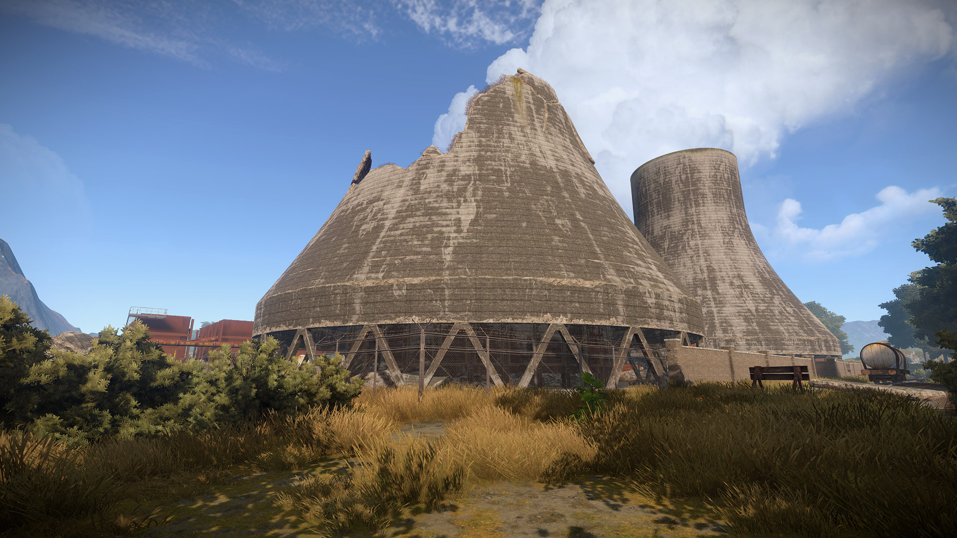
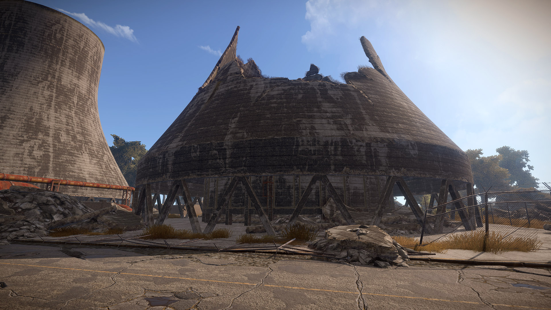
With the cooling towers art now over, I made a start on the remaining buildings. As I mentioned last week, one tower stands intact in Powerplant, while the other one has collapsed after what looks to be rocket damage from helicopter patrols. You can oversee pretty much half of the dungeon from the collapsed tower, but you can be seen from the central building as well. Overall the addition of the collapsed tower spot makes the central spot less OP. This will be part of the next wiping update.
I’ve been working on the mix a bit this week, which has been awesome from a work-flow standpoint because the prep I did previously allows me to edit everything from one place. This essentially consists of making tons of tiny changes to the majority of our sounds to help them gel together better and sound more consistent. Like they’re really all part of the same world. I’ve also been putting final touches of polish on sounds that need it, beefing up some explosions, adding a bit more punch and low end to some gunshots, adding detail to localized ambient loops, etc. Since I’m changing so many files I’m holding off on committing this stuff until it’s closer to being done, otherwise the rest of the team would be repeatedly downloading gigs of audio files which wouldn’t be very fun for them.
I recorded a bunch of raw material for the new water bucket--literally playing about with a metal bucket I bought online--and then chopped, layered, and polished the sounds up and got them in game.
I also recorded some footsteps this week. I’m working towards replacing some of our weaker footstep sounds (like the overly clicky wood footsteps), adding barefoot/shoe variations, adding materials that we don’t have sounds for yet (gravel, wet ground, etc), and adding some accents that will be played rarely (twigs breaking in the forest, wood floors creaking, armor jangling). I’m adding these in as I work on the mix, so expect some of this to hit when that’s finished.
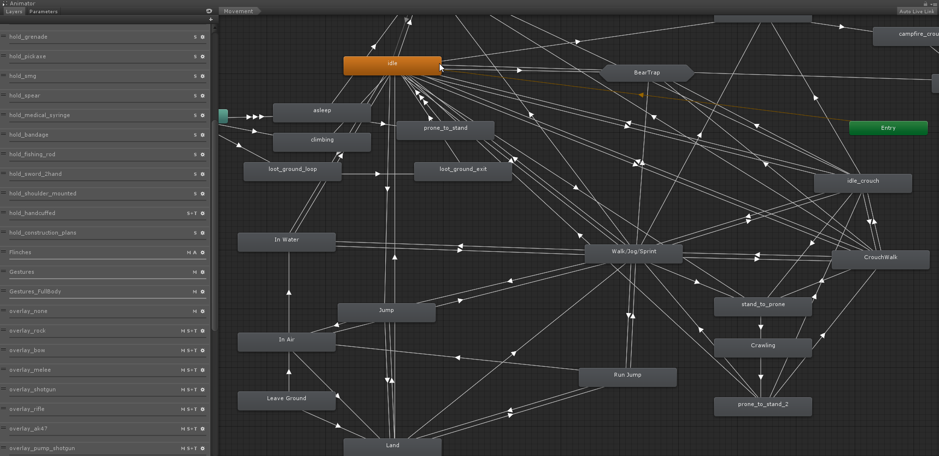
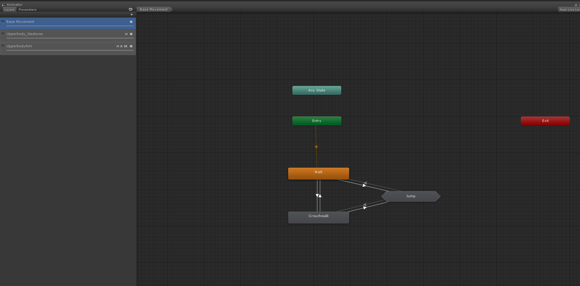
I’m doing a massive overhaul of how the player animations are done. The current system is really bloated and uses a lot of animations (which require a fair amount of memory). For each weapon the player can hold, I had a set of walk/crouchwalk/running animations, which drastically increased the number of animations required. To solve this, I’m going to use a single set of walk/crouchwalk/run animations and combine them with an upper-body animation depicting what weapon the player is holding. I’m also making some changes to the way the mecanim layers are set up by combining multiple animation layers where possible. This should have a positive effect on performance and we should see a FPS boost when several players are visible simultaneously. To give an idea of how complex the current animation system looks, here's a before and after look at the mecanim chart. I still need to add some more states, but the important thing to note is the simplification of the layers. The end result should mean a reduction in memory usage + improved framerate.
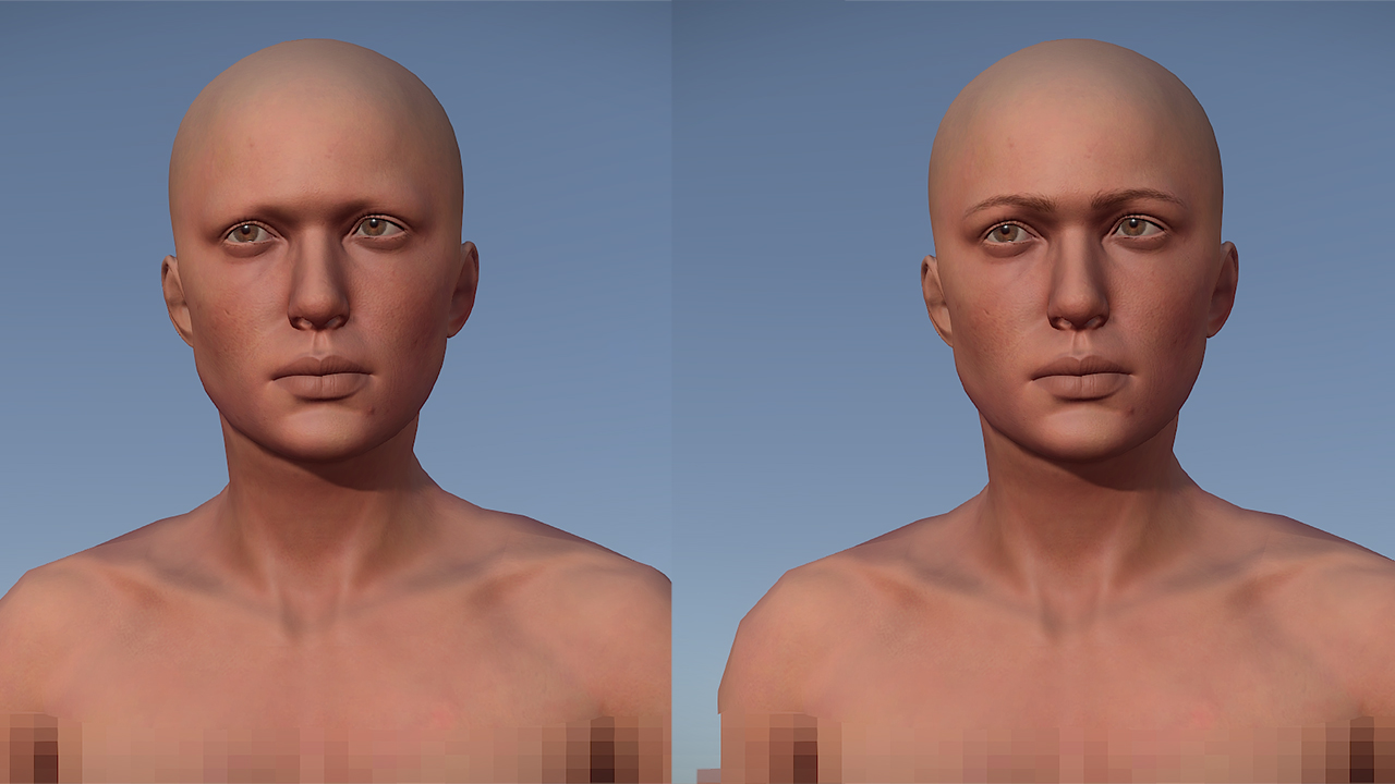
This was something I was hoping I could hold off for a while and cover all hair in one fell swoop later down the line, but everyone looked a bit weird eyebrow-less so I took some time to give each variation a set. It’ll actually be a good indicator of how real facial hair will react to some of the systems we implement going forward, such as expressive morph targets on the face!
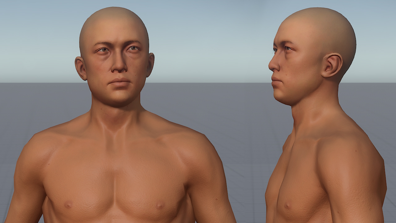
I brought the Asian male variation into the engine, although you won't be re-rolling your character just yet. We'll probably sync a re-roll with a wipe to avoid the confusion of everyone's face changing every week.
I worked on making planters after Howie masterfully concepted them. As the image above suggests, there’s two types: A 3x3 meter planter which would sit nicely on top of a single foundation, and a single row 3x1 meter planter. I still need to work on the LODs, but it’s pretty much done! Take a whirl of them here!
Remember this post on reddit? Well it inspired us to push the instruments further. Thanks, Dresdom! And so I’ve made some headway last week and this week on the instruments. So far we have the Jerrycan guitar, the flute, and I’m almost finished on the horn. I was maybe thinking about doing another version of that in the same vein as Dresdom’s reference, but I thought we could probably utilise the bone resource more here.
add_circle

Features

  • Added eyebrows
  • Added directional scattering occlusion (more realistic fog lighting)
  • Added new fog density computation for better terrain fogging
  • Added frame time when perf convar is set to 5
  • Added Flamethrower
  • Added Water Bucket
  • Added Water Barrel
arrow_circle_up

Improvements

  • Optimized entity streaming performance
  • Optimized performance of entity parenting (especially door locks)
  • Optimized runtime performance in PVT and water related scripts
  • Optimized ambience system (especially in densely vegetated areas)
  • Optimized rock performance on d3d11 (disabled far terrain splats in blending)
  • Tree and mesh qualities in options menu now go up to 200
  • Driftwood no longer spawns on rocks
handyman

Fixed

  • Fixed light clone shadow unsupported format error
  • Fixed low quality skin shader level-of-detail
  • Fixed water frame delay causing black edges when rotating camera
  • Fixed variable luminance in player model preview on Hapis
  • Fixed terrain shader issues on some drivers
  • Fixed parallax (q=1) on blended rocks placed on steep hills
  • Fixed a number of scattering related cloud issues
  • Fixed that it could sometimes rain without any clouds
  • Fixed that extreme fog wouldn’t hide the clouds
  • Fixed items being unlootable when rolling inside certain clutter objects

Newsletter

Recieve monthly updates straight to your inbox