<a href='http://playrust.com/friday-devblog-28/'><img src='http://files.facepunch.com/garry/2014/October/03/2014-10-03_20-16-27.png'></a> This week we flicked the switch, fixed voice chat, improved the UI and made animals bite you.
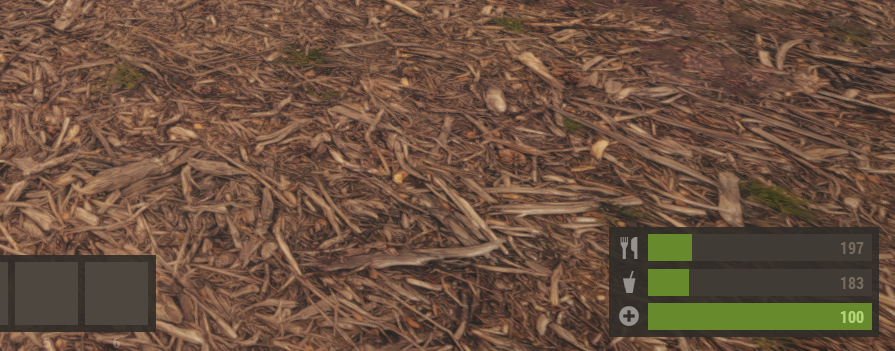
 One thing I found in the previous HUD iteration was that hunger, being cold, being poisoned.. they all meant nothing. The small icons didn't make it obvious what was happening. They didn't make it clear just how close or far away from starving you were.
 We have notifications for radiation, bleeding, hot, cold, freezing, starving, dehydration, drowning and wet.
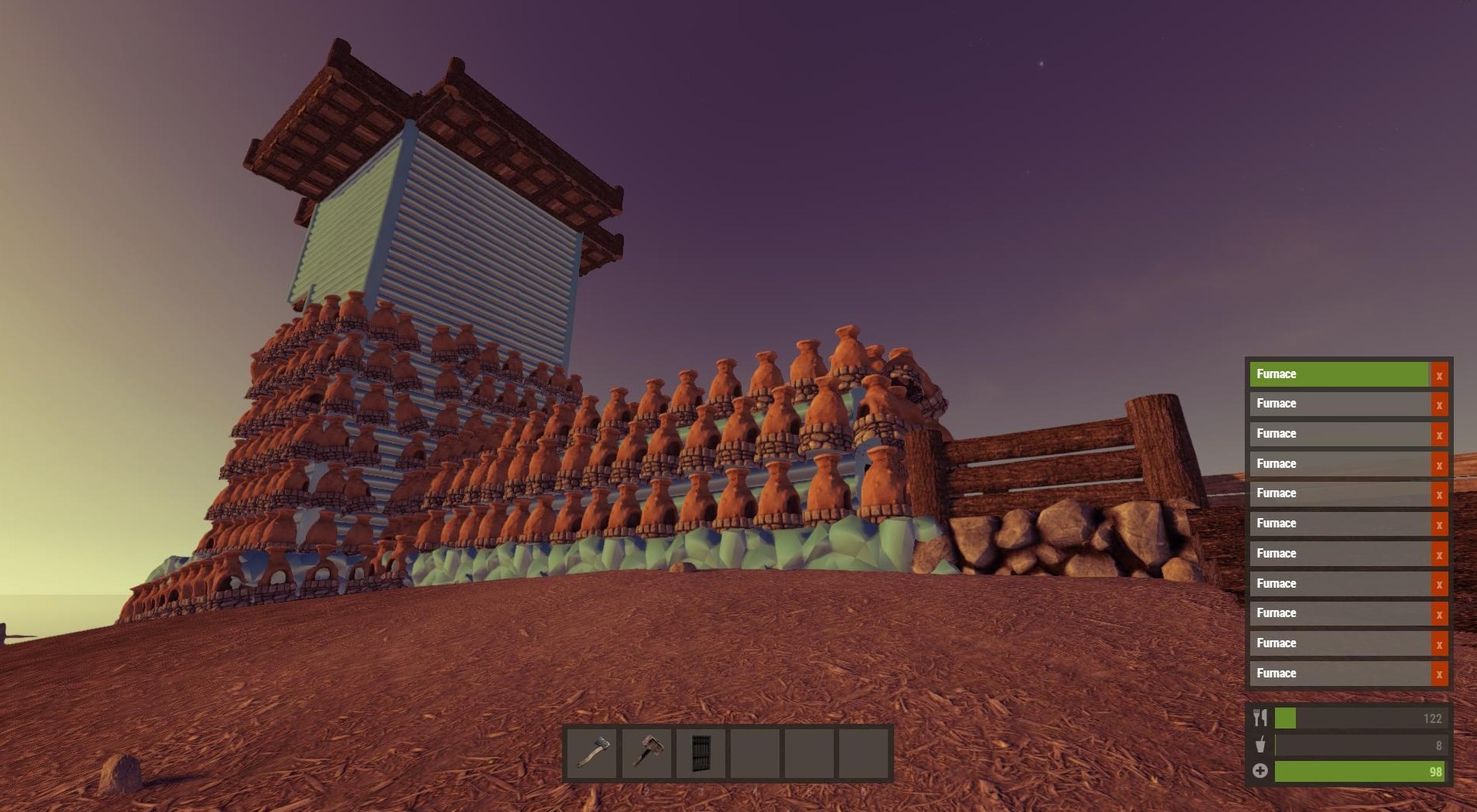
 The furnace is now destroyable again. I also made it so you can't stack them on top of each other, and you can't deploy items inside other items.

 Alex and Minh have been exploring a way to handle that without re-rigging the model. It involves adding an extra bone to the clothes item which we can then scale in our code. This sucks the clothes in, which has the effect of tucking in.
 This hasn't been implemented properly yet - but it works in theory.