Rust Marque Logo

Devblog 45

<a href='http://playrust.com/devblog-45/'><img src='http://files.facepunch.com/garry/2015/January/30/2015-01-30_21-14-32.jpg'></a> The One With The New UI
30 January 2015
Devblog
We have switched over to Unity's UI system. It's not without its problems (which they're working on) but it's a lot better than it was. While I've moved the majority of stuff over, please keep in mind that this is just under two weeks of work. I have been concentrating on moving over the most important or most complicated features. So there are things missing - which I'm working on re-implementing.
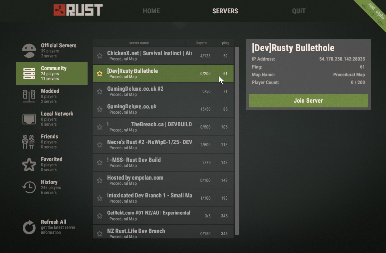
The server browser is a bit more comprehensive than the previous version. We have lists for LAN servers, favourites and history. You can add a server to your favourites by pressing the star next to its name. UnityUI is a bit slow at handling massive lists right now (they're looking into it), so I've limited the server lists to showing the top 200 servers. I'll also be adding filtering and searching tools at some point.
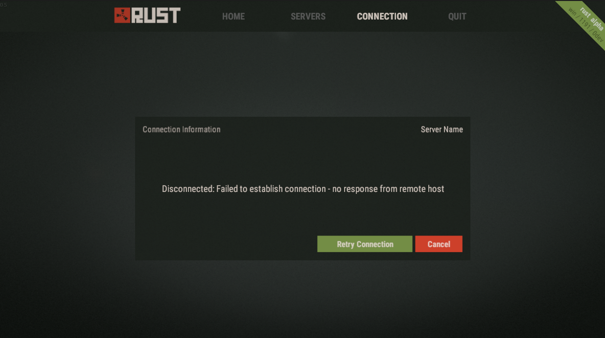
A new screen. The connection screen shows the connection status. If you disconnect from a server it will show you why. If you press escape in game and come to the menu, you'll be able to use it to disconnect. This screen a bit if a placeholder. I'm hoping to add more features to this screen that let you have more interaction with the server. Think logos, MOTD's, admin lists, connection stats (ping etc), player reporting.
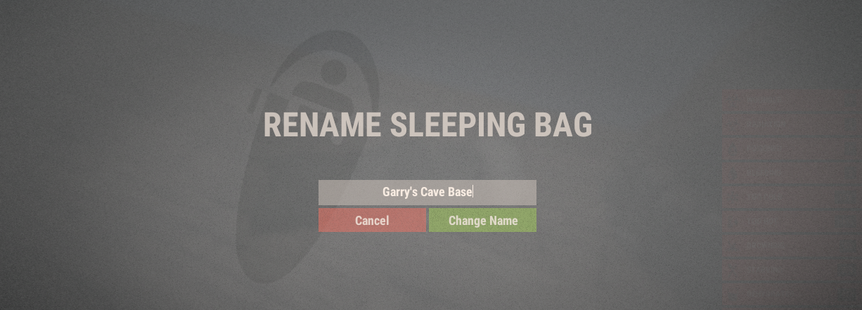
The death screen is now skipped if you've never been alive before. The left side is a bit empty right now.. but that'll change over the next few weeks. The right side should show respawn options. You can now choose which sleeping bag you want to spawn on. If you can't spawn in a sleeping bag because of a time delay, it'll show how long until you can use it right on the button. You can give your sleeping bags a friendly name in game.
The sleeping screen no longer has a wake up button. You can just press a button to wake up instead.
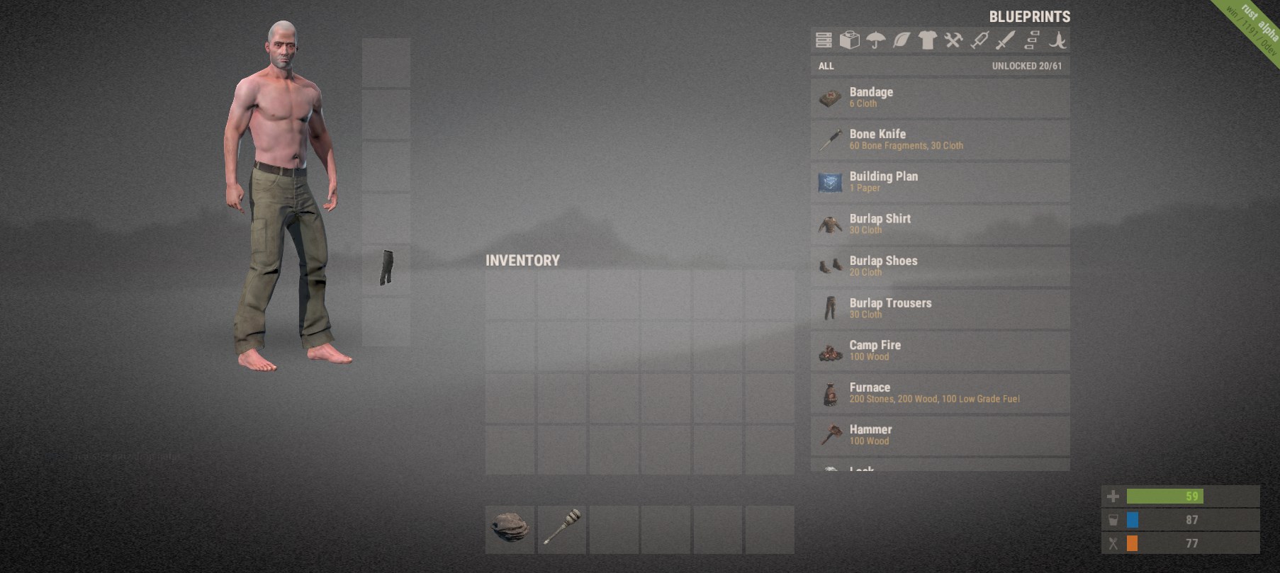
The inventory menu is now full screen and frameless. This has the disadvantage of obscuring all the stuff that's happening in the background, but it has the advantage of not looking like shit. It might be a bit big on larger resolutions. Next week I'll be adding some scaling options - so you'll be able to make it smaller based on your preference.
Splitting has changed, and it's something you need to be taught. If you select a stack you'll get a split widget. Simply drag the bar to the amount you want to take, then drag the icon to where you want to put it. But that's not all:
  • Left mouse button dragging a stack drags the whole thing
  • Right mouse button dragging drags a single item
  • Middle mouse button dragging drags half the stack
It's our belief and hope that the three clicks required to split accurately is offset by the fact that you'll probably never actually do that, opting instead of use the middle/right mouse buttons. But we'll see how it works out.
You can select an item by clicking on it. This will show information about the item at the top of the screen, along with any options it may have (like eating food). This area is under-utilized right now - but we have plans that justify its existence. You also drop items using this method. I can appreciate that this sucks, next week I'll add options to drag out of your inventory to drop.
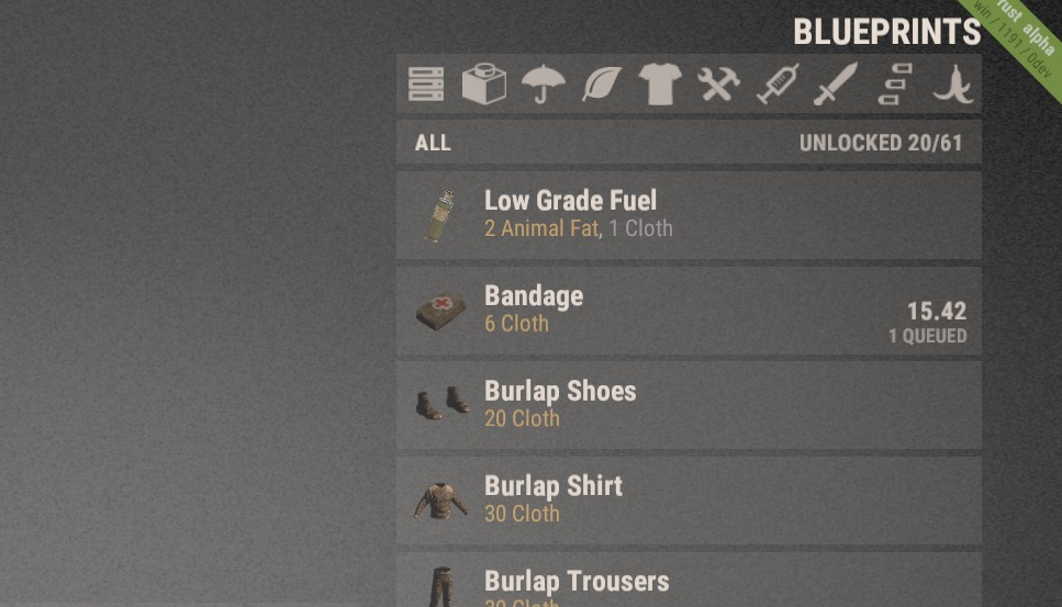
The new blueprints list have an "All" category. They also show how many you have unlocked. You can scroll through the list by dragging it up and down. The items you can't craft because of a lack of resources are at the bottom, the rest are ordered by title. When you are crafting something a timer will show up, along with how many others are queued. You can cancel an item you have queued by right clicking. This is a lot more simplified compared to the previous version - and you do lose a degree of control.. but we'll see how it goes.
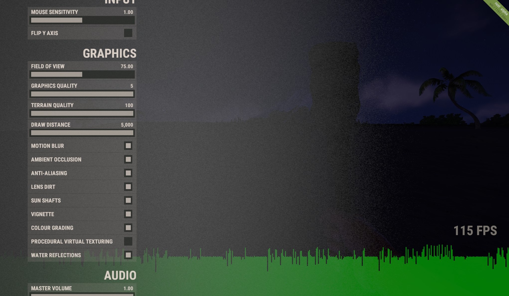
The tweaks window has been redesigned and has a few new options. It also shows the framerate, and has a framerate graph along the bottom. This should make it easier for you to see if changing the settings here has any performance benefit. I am noticing now that the grey background gradient is horrible, so I'll tweak that next week. Let me know what other options you want here.
Chat now has steam avatars and admin/developer names are a different colour. Next week I need to add history and fix that white line at the bottom of all of the avatars.
We are currently testing a system to partially randomize rad town and monument layouts based on the server seed. You can look at it as a simplified version of the AI Director in Left 4 Dead. It can for example remove or add walls, buildings or other objects from rad towns to make it harder for people to learn the exact layout and loot positions. The long-term aim is to force people to always be prepared for surprises when entering a rad town, even if they have seen this specific rad town type before. For now we are using this system very scantily in order to test that everything works as it should. At this stage it is little more than a proof of concept to see what kinds of randomizations could make sense when we design rad towns in the future, but expect to see or not see some rad town entrances and objects depending on which server you are playing on.
Rust likes using RAM. Sometimes it uses RAM for good reasons in order to speed up execution time by only doing certain calculations once and storing the result for future use. Sometimes it uses RAM for reasons that are less sane than that. We did some changes this week in an attempt to throttle memory usage on our end by removing components only the server needs from client builds and making sure procedurally generated textures are removed from RAM once they have been uploaded to the graphics card if we can guarantee that they’ll no longer be needed by the CPU. Those changes are no silver bullet that will magically allow you to play Rust on your toaster, so in order to keep track of memory usage in the future we added a new system information section to the F1 menu that displays the memory that is available on your machine, the memory that is currently used by Mono (i.e. memory we use and manage in our scripts) and the total number of garbage collections the game had to do since startup. Unity itself also manages some memory for things like meshes, textures and the like which cannot be seen in the stats window at this point, but is planned to be added in the future. It’s a good idea to screenshot the system information panel when you’re having issues and want to ask for help on the forums or Reddit or plan to submit a bug report.
EAC has been turned off for the last week while the guys debugged why people were seemingly being kicked randomly. They've done that now - so it's back armed. Some guys have found that you can fuck about with the big resources file to create cheats. I could have spent time writing code to stop that, but the EAC guys are working on a better, more global solution for that, which should be ready quite soon.
Unity 5 beta 21 fixed one of our issues with dynamic reflection probes, which allowed us to enable water reflections on OS X and Linux again. This means if you play on those platforms you will finally see proper water colors instead of some solid grayish plane that’s too dark at day and too bright at night. It’s still possible that some software / hardware combinations see black pixels in the dynamic reflection probe, which are mostly visible on water and shiny materials. Water now also features a flow map that’s based on the world normal map. This means you’ll no longer see water flow away from the shore, but instead it should always flow in a direction that at least makes some sense. This change will also allow us to add proper 3D displacement waves in the future.
We added some random mushrooms to certain trees. You cannot gather them just yet as they are merely meant to test a new dynamic object placement system at this point. That being said, we are planning to let you interact with those little details eventually. Players could get their starting rock by picking up a small rock from the ground or survive their first night by eating mushrooms or berries and craft their first tool by gathering small pieces of wood.
The linux version should now work again!
Nothing much has changed with vitals. Some of them show a bit more accurate data. That's it.
People keep asking us what the checksum mismatch warning in the console means, so here we go. The checksum is supposed to compare the world the server generated to the world your local machine generated. In the future this will be used to kick clients whose checksums do not match the server’s checksum. For now the mismatch is merely a warning that has no consequences for the client whatsoever. We simply print it to the console and send some info our way in order to see how many people are affected and iron out any bugs that might have caused the mismatch. We found and fixed one bug that could cause a mismatch earlier this week, so we’re hoping to see a lot less of those warnings pop up over the next days.
Man, that's been a bit of a crunch for the last couple of weeks.. but it feels great to have got it all done. I'm going to spend next week cleaning it all up, fixing bugs, adding back missing features and taking feedback. I've added the Raknet source code to our native dlls too - all ready to be used.. so I'll have a go at that too.. which should fix some of the network issues we've had with lidgren. Let me know about any problems/ideas/opinions you have with the new UI either via @garrynewman or in the forum.

Newsletter

Recieve monthly updates straight to your inbox